[CSS小ネタ] どうしても本文に游ゴシックを使いたい時のCSS指定
追記 20180416
最近のChromeのバージョンでは、以下サイトの方法が最良です。
必要な時はしばらくこんな具合で使ってみます。
1 | font-family: "游ゴシック Medium", "Yu Gothic Medium", "游ゴシック体", YuGothic, "Hiragino Kaku Gothic ProN", "ヒラギノ角ゴ Pro W3", Meiryo, Verdana, sans-serif; |
※ここから下は現在参考になりませんのでご留意ください。
参考サイト
以外と厄介なんですね…
妥協案
1 2 3 4 5 6 7 8 9 10 11 12 13 | @font-face { font-family: "Yu Gothic"; src: local("Yu Gothic Medium"),local("Yu Gothic"); font-weight: 500;}@font-face { font-family: "Yu Gothic"; src: local("Yu Gothic Bold"),local("Yu Gothic"); font-weight: bold;}body { font-family: "Yu Gothic", YuGothic, sans-serif;} |
たまにこんな塩梅で使っています。
1 2 3 4 5 | body { font-family: "Yu Gothic", YuGothic, "Lucida Grande", "Hiragino Kaku Gothic ProN", "ヒラギノ角ゴ Pro W3", "メイリオ", Meiryo, Osaka, Verdana, sans-serif; font-feature-settings: 'pkna'; letter-spacing: 0.5px;} |
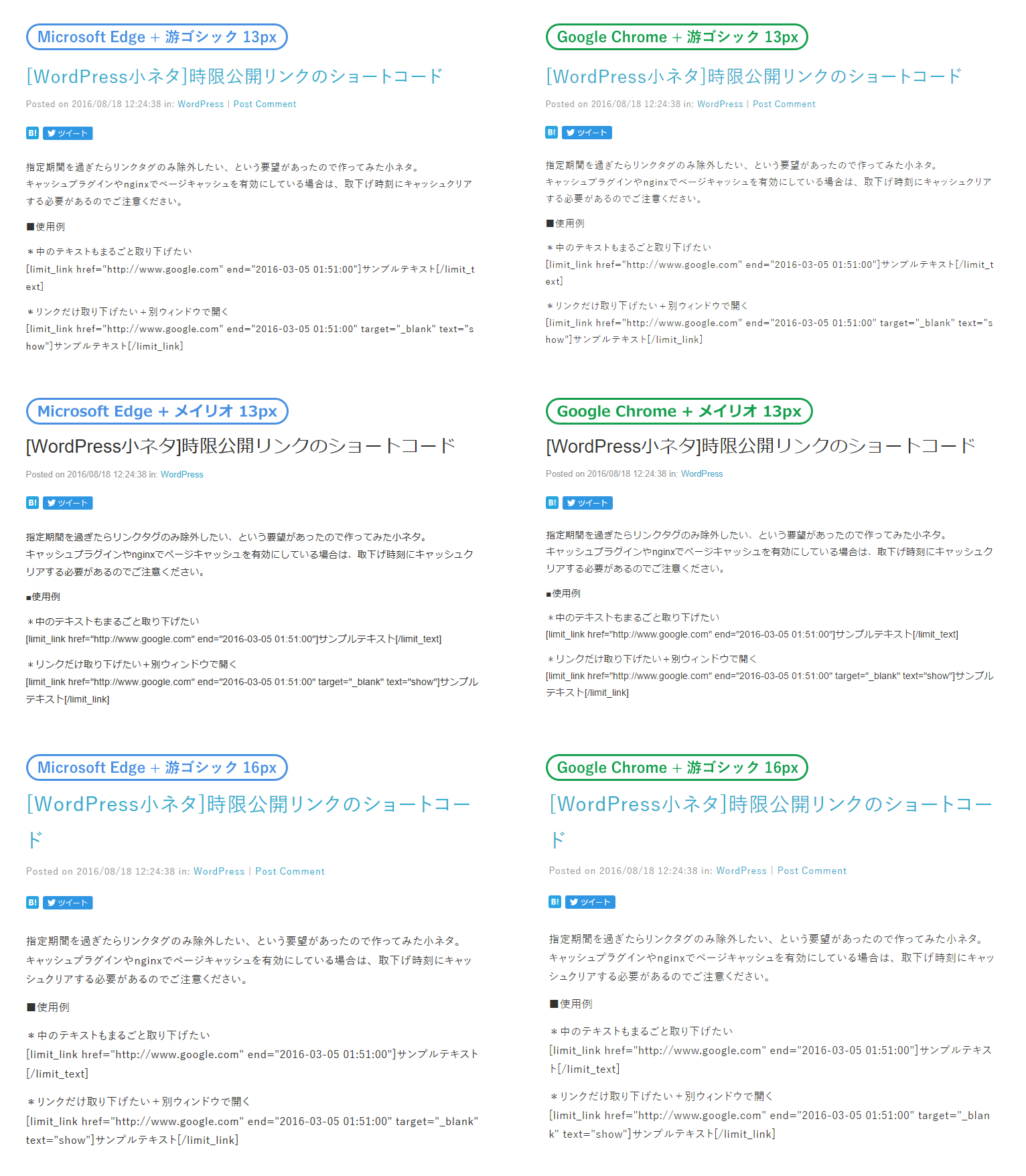
比較画像を作ってみました。
游ゴシックは16px未満だと本文書体としては厳しそう。